UNICEF - ANGOLA FINANCIAL DASHBOARD
\ Overview
UNICEF Angola works with local governments and partner organizations to improve children’s health and nutrition across the country. DataWhale partnered with UNICEF Angola to transform complex nutrition data into an accessible analytics dashboard for policymakers, researchers, and program managers.
As the Product Designer, I was responsible for the dashboard’s information architecture, data visualization, interaction design, and responsive experience. My goal was to make large amounts of public health data easier to understand, compare, and act on.
UNICEF Angola works with local governments and partner organizations to improve children’s health and nutrition across the country. DataWhale partnered with UNICEF Angola to transform complex nutrition data into an accessible analytics dashboard for policymakers, researchers, and program managers.
As the Product Designer, I was responsible for the dashboard’s information architecture, data visualization, interaction design, and responsive experience. My goal was to make large amounts of public health data easier to understand, compare, and act on.
Agency
Agency
Data Whale
Data Whale
Client
Client
UNICEF
UNICEF
Role
Role
Product Designer
Product Designer
\ Dashboard Design
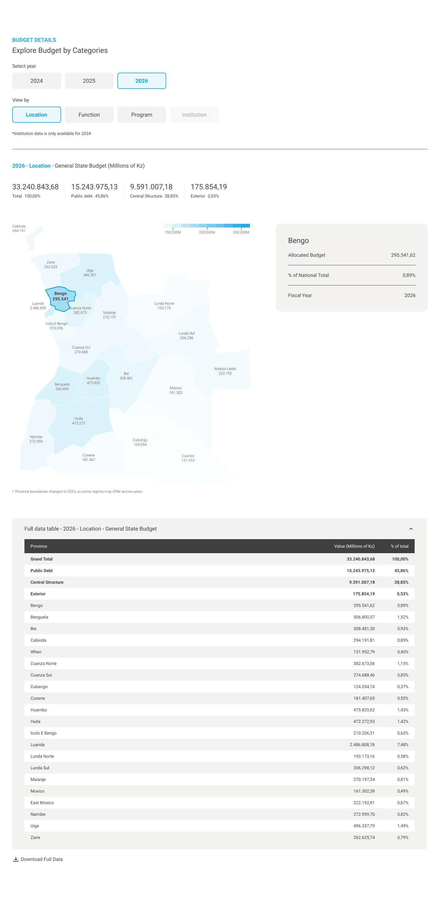
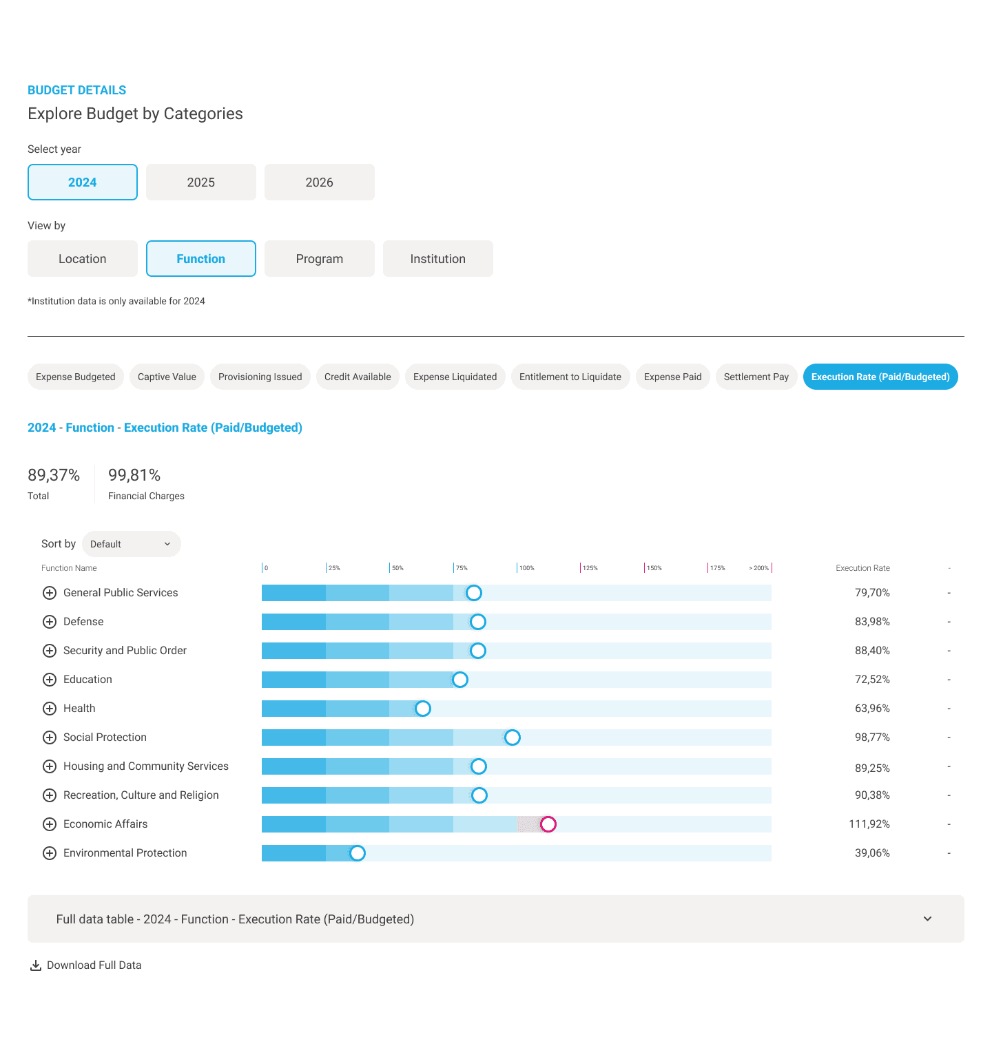
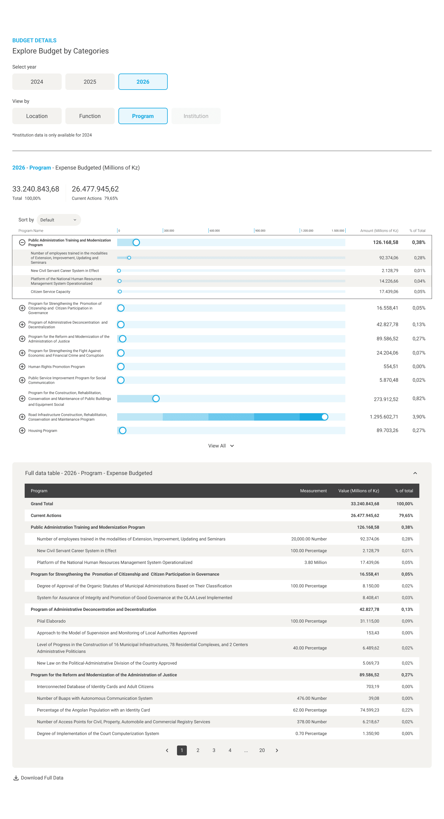
The dashboard follows a clear narrative, moving users from a high-level overview to historical trends and more detailed data. Key metrics at the top provide an immediate understanding of the current situation, while the timeline and supporting visualizations help users explore changes across time, regions, and indicators.
One of the main challenges was presenting datasets with different scales and relationships without overwhelming users. I selected chart types based on the purpose of each dataset and created a consistent visual system for colors, labels, and spacing. Filters, tooltips, hover states, and drill-down interactions reveal additional detail only when needed, allowing the dashboard to remain clear while still supporting deeper analysis.
The dashboard follows a clear narrative, moving users from a high-level overview to historical trends and more detailed data. Key metrics at the top provide an immediate understanding of the current situation, while the timeline and supporting visualizations help users explore changes across time, regions, and indicators.
One of the main challenges was presenting datasets with different scales and relationships without overwhelming users. I selected chart types based on the purpose of each dataset and created a consistent visual system for colors, labels, and spacing. Filters, tooltips, hover states, and drill-down interactions reveal additional detail only when needed, allowing the dashboard to remain clear while still supporting deeper analysis.
Dashboard Overview
Dashboard Overview

Location
Location




Function
Function



Program
Program


\ Responsive Design
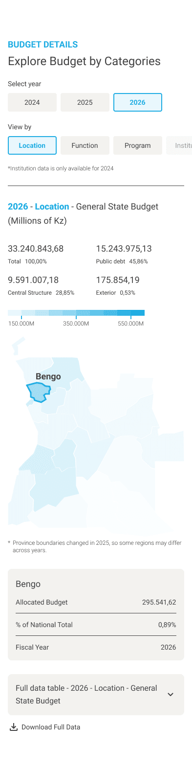
The mobile experience was not simply a smaller version of the desktop dashboard. I reassessed the information hierarchy and prioritized the metrics and insights users were most likely to need on smaller screens.
Secondary information was simplified, reorganized, or removed, while wide tables and complex charts were adapted into stacked and touch-friendly formats. This allowed users to explore large datasets without excessive zooming or horizontal scrolling, while preserving the dashboard’s core analytical value.
The mobile experience was not simply a smaller version of the desktop dashboard. I reassessed the information hierarchy and prioritized the metrics and insights users were most likely to need on smaller screens.
Secondary information was simplified, reorganized, or removed, while wide tables and complex charts were adapted into stacked and touch-friendly formats. This allowed users to explore large datasets without excessive zooming or horizontal scrolling, while preserving the dashboard’s core analytical value.