Revive

\ Overview

Revive helps homeowners renovate before selling, without paying renovation costs upfront. Its Construction Dashboard connects homeowners, agents, contractors, and project managers around renovation progress, updates, and documents.

Revive helps homeowners renovate before selling, without paying renovation costs upfront. Its Construction Dashboard connects homeowners, agents, contractors, and project managers around renovation progress, updates, and documents.

I led the dashboard redesign from research and information architecture to interactive prototyping and detailed Figma design across desktop, tablet, and mobile.

I led the dashboard redesign from research and information architecture to interactive prototyping and detailed Figma design across desktop, tablet, and mobile.

2 weeks

Research & direction

Research & direction

Walkthrough · Recordings · Interviews · References

→
↓
1 week

Prototype & align

Prototype & align

Claude Design · Team and user feedback

→
↓
~4 weeks

Refine & deliver

Refine & deliver

Figma · Responsive UI · Design handoff

Company

Company

Revive Real Estate

Revive Real Estate

Role

Role

Product Designer

Product Designer

Date

Date

April. 2026 - July. 2026

April. 2026 - July. 2026

\ Current Dashboard

Improve an experience already in use

When I joined, the dashboard was already live, built by engineers with AI assistance. With time and budget for a redesign, I first investigated how people used it and where it broke down.

When I joined, the dashboard was already live, built by engineers with AI assistance. With time and budget for a redesign, I first investigated how people used it and where it broke down.

Four complementary ways to understand the problem

01 · Walkthrough

Inspect the experience

I walked through agent, homeowner, and contractor flows, documenting navigation, labels, hierarchy, and duplicated information.

I walked through agent, homeowner, and contractor flows, documenting navigation, labels, hierarchy, and duplicated information.

02 · LogRocket

Observe real behavior

I reviewed session recordings and noted competing scroll areas, hidden new-update signals, and confusing upload recovery.

I reviewed session recordings and noted competing scroll areas, hidden new-update signals, and confusing upload recovery.

03 · User interviews

Understand the work

I interviewed agents about project check-ins, trusted information, and client communication. Weekly Updates mattered; Scope could lag behind.

I interviewed agents about project check-ins, trusted information, and client communication. Weekly Updates mattered; Scope could lag behind.

04 · Product references

Explore useful patterns

I compared Jira, Asana, Slack, ClickUp, and Teams for overview pages, previews, unread signals, and role-based grouping.

I compared Jira, Asana, Slack, ClickUp, and Teams for overview pages, previews, unread signals, and role-based grouping.

I conducted all four research activities. The annotated audit below captures the starting experience; the next section shows how I translated the evidence into priorities.

\ Research → Direction

I compared observed behavior with interview needs, then used product references to explore possible responses. The synthesis led to three connected design priorities.

I compared observed behavior with interview needs, then used product references to explore possible responses. The synthesis led to three connected design priorities.

01 · Interviews + product references

OBSERVED

Visits were often triggered by notifications, but new activity was hard to see on the project page.

Visits were often triggered by notifications, but new activity was hard to see on the project page.

→
↓

USER NEED

Catch up quickly

What changed since my last visit?

→
↓

DIRECTION

Summary first

Make recent changes, progress, and routes to detail visible at the project entry.

02 · Recordings + interviews

OBSERVED

Users moved between update lists and detail panels; Weekly Updates were an important project reference.

Users moved between update lists and detail panels; Weekly Updates were an important project reference.

→
↓

USER NEED

Keep the context

How does this update fit the project?

→
↓

DIRECTION

Scannable project history

Use previews and a continuous update history, with clear paths into supporting detail.

03 · Product walkthrough

OBSERVED

Navigation varied across roles; contacts were duplicated and some labels obscured the meaning of content.

Navigation varied across roles; contacts were duplicated and some labels obscured the meaning of content.

→
↓

USER NEED

Find the right information

Where should I look for this?

→
↓

DIRECTION

Consistent architecture

Standardize navigation and group content by meaningful attributes: dates, roles, and status.

FOCUS

Project understanding first

Prioritize overview, scannable updates, and clear navigation. Keep full task-management complexity outside the core redesign.

Prioritize overview, scannable updates, and clear navigation. Keep full task-management complexity outside the core redesign.

DEPENDENCY

Clarity needs reliable data

Interviews showed Scope could lag behind actual work. A clearer interface still depends on up-to-date operational information.

Interviews showed Scope could lag behind actual work. A clearer interface still depends on up-to-date operational information.

Early Summary concept from the research board.

Make the direction tangible

I revised the information architecture, then built a Claude Design prototype for team and user reviews. This made the proposed structure discussable before detailed Figma work.

I revised the information architecture, then built a Claude Design prototype for team and user reviews. This made the proposed structure discussable before detailed Figma work.

I defined the priorities, interpreted feedback, and refined the design. AI helped make the early direction interactive.

\ Dashboard Redesign

Rather than treating each feature as an isolated improvement, the redesign reimagined the dashboard as a unified workspace for every stage of a renovation project. A new Summary tab was introduced to give agents an at-a-glance overview of completed work and AI-generated renovation summaries, while the existing tabs were reorganized to improve clarity, navigation, and project visibility. Weekly Updates evolved into a continuous Timeline that better communicated project progress, and Project Scope, Photos, Team, and other sections were restructured with a more consistent information hierarchy and interaction model.

Rather than treating each feature as an isolated improvement, the redesign reimagined the dashboard as a unified workspace for every stage of a renovation project. A new Summary tab was introduced to give agents an at-a-glance overview of completed work and AI-generated renovation summaries, while the existing tabs were reorganized to improve clarity, navigation, and project visibility. Weekly Updates evolved into a continuous Timeline that better communicated project progress, and Project Scope, Photos, Team, and other sections were restructured with a more consistent information hierarchy and interaction model.

\ PRE-CONSTRUCTION EXPERIENCE

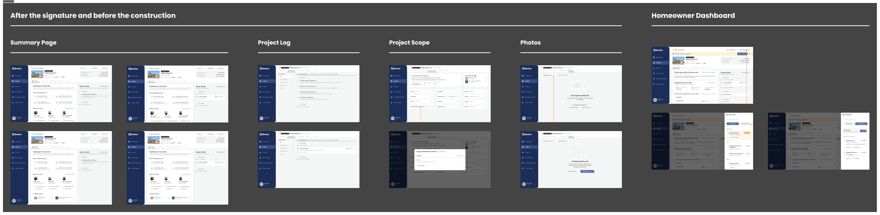
The original dashboard was designed primarily for active construction, leaving a gap between contract signing and the start of renovation. During this period, users encountered numerous empty states, making projects appear inactive even though substantial preparation was happening behind the scenes.

To address this, I designed a dedicated pre-construction experience that communicates ongoing progress while construction has not yet begun.

The redesign introduced tailored empty states, milestone messaging, contextual guidance, and preparation-related information to reassure homeowners that the project was actively moving forward. Rather than presenting an unfinished dashboard, the interface now reflects the unique needs of this transitional project phase.

The original dashboard was designed primarily for active construction, leaving a gap between contract signing and the start of renovation. During this period, users encountered numerous empty states, making projects appear inactive even though substantial preparation was happening behind the scenes.

To address this, I designed a dedicated pre-construction experience that communicates ongoing progress while construction has not yet begun.

The redesign introduced tailored empty states, milestone messaging, contextual guidance, and preparation-related information to reassure homeowners that the project was actively moving forward. Rather than presenting an unfinished dashboard, the interface now reflects the unique needs of this transitional project phase.

\ FINAL DELIVERABLES

The project concluded with a comprehensive design system and engineering handoff that transformed early concepts into production-ready deliverables. Every experience—from the pre-construction phase to project completion—was fully documented across desktop, tablet, and mobile, with responsive behaviors, reusable components, interaction details, and implementation guidance carefully specified in Figma.

Rather than focusing only on ideal user flows, the final designs accounted for edge cases, transitional states, and real-world scenarios, ensuring the product remained consistent, scalable, and ready for development.

The project concluded with a comprehensive design system and engineering handoff that transformed early concepts into production-ready deliverables. Every experience—from the pre-construction phase to project completion—was fully documented across desktop, tablet, and mobile, with responsive behaviors, reusable components, interaction details, and implementation guidance carefully specified in Figma.

Rather than focusing only on ideal user flows, the final designs accounted for edge cases, transitional states, and real-world scenarios, ensuring the product remained consistent, scalable, and ready for development.