.png)
Jiffy Lube Abandoned Cart
In 2023, Jiffy Lube, a leading car maintenance company, introduced MyJiffyLube (MJL), a feature on JiffyLube.com that provides personalized service estimates for prospective customers. Despite this innovation, a significant number of users were abandoning the estimate process before submitting their requests.
To address this challenge, I collaborated with Jiffy Lube and the strategy team at AKQA to analyze the existing estimate flow, identifying potential pain points causing user drop-offs. Using these insights, I redesigned the estimate flow in wireframes, aiming to improve the submission rate by enhancing the user experience.
After completing the wireframes, I handed them over to AKQA’s design team for further refinement. The updated designs are now in development, and we are eager to see how these improvements impact the estimate submission rate.
Agency
AKQA
Role
UX Designer
Date
Apr. 2024 - Present
Status
Under Construction
Feature Team
Christoph Friess(UX Director), Andrew Plempel(PM), Jorge Corrales(UI), Kenji Tomita(UI), Charley Zheng(Strategy Director) + Dev Team
▌DESIGN PROCESS ▌
DISCOVER
DEFINE
IDEATE
DESIGN
DELIVER
Context
Goals & Objectives
Strategic Imperatives
Iterative Design
New Estimate Flow
User Feedback
Review Current Journey
Key Issues
Different Scenarios
All Scenarios
Annotation
▌DISCOVER ▌
Context

In 2023, JiffyLube launched MJL to provide a more personalized service experience, including the ability to get service estimates.
150K
Monthly average # of users who enter the estimate flow
33.5%
Of users convert (in-store) by submitting quotes to store
84%
Of converted quotes (in-store) come from new customers
+18%
Average ticket value of MJL is 18% higher than the system average
However, a significant number of users “abandon cart” and drop out of the estimate flow.
81%
Of users who use the estimate tool drop off before they make it to select services and “Start an estimate”

9%
Of users who make it to select services drop off without clicking Review
43%
Of users who click Review drop off before submitting estimate to store

Before we dive into the details of the estimate flow, we need to examine the broader journey itself, identifying where the disruptions are and what we can do to make the tool more usable, valuable, and effective.
The online estimate process plays an important role in servicing customer needs pre-visit, impacting conversion and car count down the line.

Getting an estimate is a valuable step in the journey, helping customers set expectations, manage their budgets, and make informed decisions about their service needs.
User Feedback
Customers have a number of priorities when seeking an estimate for their car care needs.
Speed
I want the process of getting an estimate to be quick and efficient
Convenience
I want to be able to request and receive an estimate easily without the need to physically visit a shop
Transparency
I’m looking for clear, understandable estimates that break down the costs of labor and parts so I can manage my budget
Accuracy
I want the estimate to be reasonably close to the actual costs I will eventually incur
Competitive pricing
I am looking for a service provider that offers the best value
Flexibility
I want choice in how I tailor the scope of work, like choosing between different levels of service (basic vs comprehensive)
Comprehensiveness
Beyond just the costs, I am interested in what warranties or guarantees are offered with the service, the estimated time for completion of the work, and any additional services (eg shuttle service)
Reputation & reviews
I want to ensure I am dealing with a reputable shop that is known for quality service and fair dealings
User feedback reveals a number of friction points along the estimate journey.
Uneven value exchange
“Used your website for first time. NOT GOOD. Too much information just to see how much an oil change would cost.”
Unfulfilled promises
“Many services have no estimates available. What a waste of time filling out info if I can’t get the answers I’m seeking. “
Overly demanding
“The estimate requires my VIN. My VIN is on my car, not in my phone. I live in the third floor. I don’t want to go downstairs to get something you do not need.”
Misleading
“After submitting an estimate, we took my car in and were told that store doesn’t work on Volkswagens. Why was I allowed to input this vehicle in the first place?”
Perceived inaccuracy
“Online, the service for an oil change was quoted to me as $49.99. When I went to the store, I was told the cheapest service was $99.99 for the manufacturer recommended oil. No apology of adjustment was offered.”
Doesn’t meet need for Speed, Convenience
Doesn’t meet needs for Speed, Convenience, Transparency, Accuracy, Competitive Pricing
Doesn’t meet need for Speed, Convenience
Doesn’t meet need for Accuracy, Transparency, Flexibility
Doesn’t meet need for Accuracy, Transparency, Comprehensiveness
▌DEFINE ▌
Goals & Objectives
For estimates to be more successful in driving car count, we must improve the utility and convenience of the end-to-end estimate journey.
Key ambitions
Decrease drop-off rates
Streamline the path to submission, limiting friction wherever possible
Re-engage abandoned users
Re-target and bring back users who drop out along the way
Increase estimate submissions
Give users a reason to submit their estimate to the store
Increase email open rates
Increase audience engagement with estimate reminder emails, spurring in-store visits
Increase conversion
Increase the rate of service fulfillment and in-store visits driven from the estimate process
Review Current Journey
To uncover opportunities for optimizing the estimates journey, we audited the online experience to identify the most prominent areas of friction.
1. Start an Estimate
Multiple CTAs on the homepage create the risk of fragmenting attention, while copy discrepancies create inconsistency and inaccuracy
While the CTA for Get An Estimate is prominent and obvious on the homepage banner, the presence of three other CTAs (Find a location, find coupons, explore auto services) distracts and pulls the focus away from the main Estimate button.
There is slightly different language used below in a separate module, “Enter info for pricing.” The inconsistency of the language may feel a little confusing, and promising “pricing” may feel misleading as well.


Expectation setting lacks some focus and could benefit from additional transparency/context
When getting started with the estimate process, the user is presented with an overview of the number of steps required to complete the process. While this is helpful in setting expectations, there could be additional context-setting provided in the box below to prep the customer for what’s to come, such as: What kind of vehicle information do I need at the ready before I get started? This may be more helpful than showing all the services below. The accordion options below also introduce unnecessary cognitive overload.
Also, while there is a prompt that tells customers they need to confirm their preferred store in order to get started on an estimate, this step is not shown in the progress tracker.


2. Select Preferred Store
Store selection diverts users to a new URL path and a different progress tracker, creating some risk for confusion. Store results also appear undifferentiated.
The customer is then prompted to select their preferred service location. However, this takes the customer to an entirely new URL path (from /get-an-estimate to /vehicle/preferred-location) AND a different progress tracker.
There’s no ability to filter by distance or understand proximity of each location, and while the user can filter by services, hours/amenities/, the results themselves do not share any additional detail about each store.
Because customers also care about reputation and reviews, it would be helpful to see how each store is rated by customers.

3. Enter Your Info
VIN retrieval introduces significant work in the journey
Once a location has been set, the customer is then prompted to enter their vehicle’s information. Both the diagram & the ability to upload an image is helpful—but here, we lose the progress tracker and our orientation to where we are in the process. Additionally, there is no BACK button to seamlessly retrace our steps, or correct information if needed.
The placement of this step also forces the customer to pause the process and break the momentum in order to retrieve the information.
Data Point
Based on the data from May 26, 2024 - June 1, 2024:
There is a lower drop off rate for “Enter Information Manually” (24.2%) vs the “Take Photo Scan” CTAs (54.2%)

The two separate modes and CTAs for VIN input are unclearly worded, creating confusion and risk for backtracking/bouncing
If the customer chooses to enter VIN information manually, they are brought to this next step, which asks them again to input their vehicle details with two different CTAs. The copy is confusing — it’s not clear what the difference between “entering your VIN” or “manually entering the information” is.
Additionally, the # of clicks & micro-steps at this point already feel excessive.


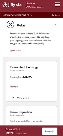
4. Browse & Add Services
Service pricing is inconsistently available and information feels sparse about the terms & limitations of estimates
After having a store set and vehicle information entered, the customer can now select the services they are interested in. Some services show starting prices, but provide no further context on how estimates are calculated for specific vehicles. Other services require the customer to contact the store for pricing, which defeats the purpose of the tool.
The CTA “Start an estimate” can be confusing, as technically the customer has already started one.
Additionally—there’s a lot of services to choose from, and the accordion tabs make the page feel like a big long scroll — between “Start an estimate,” “Learn More,” and “View Details” for each service, it feels like an overload of buttons and tasks.


Services that require store contact present an inconvenient hurdle, introducing an added step that’s high-effort
When clicking Learn More on a service that requires the customer to contact the store, this modal pops up with options to call the store (opening FaceTime) or add service to estimate. There’s no further context around what the store will ask, or what the store may need from the customer that they haven’t already provided.
Additionally, the message “This service requires vehicle evaluation for accurate pricing” may disincentivize people from taking further action online.
The option to add service to estimate is also confusing because there aren’t any prices associated with this service.

For popular services like oil changes that offer multiple options & prices, an absence of personalization creates more work for the user
When exploring oil change options, the customer is presented with a number of oil services, as well as starting prices for each. Again, showing prices at this stage may deter customers from moving forward with the estimate submission process because some may already be getting what they’re coming for.
Additionally, despite having a vehicle set, the customer is being asked to make a manual selection on the type of oil service they’d like.

5. Email Capture
The prompt for account sign-up shows up at an awkward time, introducing yet another moment of disruption.
Between service selection and estimate review, a modal pops up to prompts customer if they want to create an account — this feels odd in the flow where the customer is so close to the bottom of the funnel. Introducing a separate path/process at this stage feels disruptive and raises the risk of bouncing.

6. Review Estimate
There is little incentive for users to submit their estimate to the store, and a missed opportunity to clarify expectations by reiterating how estimates work.
On the Review and Submit Estimate page, customers have the opportunity to look over their total estimate, adjust or update their services, and submit the estimate to store or save the estimate for later.
There are very few incentives given to explain the value of submitting the estimate to store—just that it will save the customer time during check in.
There is also a lack of detail about how Jiffy Lube calculates estimates, and what a customer should expect/know about the current estimate total. Pricing is very high-level and doesn’t break down other information like labor or parts.

7. Submit Estimate
An added step to include basic contact information after the user has already clicked “Submit estimate to store” creates unexpected disruption.
In order to submit their estimate to the store, customers must first provide their name and email to send out the estimate. This feels like it’s coming rather late in the flow, and feels like another barrier to submission.

8. Email Confirmation & Reminders
Confirmation and reminder emails simply replicate the estimate without providing further utility, providing little reason to engage.
Confirmation and reminder emails provide the same details as originally viewed in on the site. There are no further incentives provided to encourage an in-store visit, and limited opportunity to interact or engage further with the email.


Summary of Key Issues

▌IDEATE ▌
Strategic Imperatives
Based on our audit findings, there are a few strategic imperatives we need to elevate.

▌DESIGN ▌


Iterative Design
- Estimate Landing Page
Streamlined the estimate process by consolidating info entry and enhancing clarity.
Originally, users had to input Preferred Location, Vehicle Info, and Contact Info through separate flows, creating a fragmented experience. To simplify this, we consolidated info entry into the estimate flow, replacing multiple entry points with a single “ENTER INFO & START ESTIMATE” CTA for clarity. To maintain CTA visibility, we limited the displayed steps. Meanwhile, an Estimate FAQ section was added to address common user questions.


Iterative Design
- Vehicle Input
Optimized vehicle input for clarity and flow.
Based on data, we set Select Vehicle as the default input method, as Enter Information Manually had a lower drop-off rate (24.2%) compared to Take Photo Scan (54.2%). To improve usability, we replaced dropdown menus with visible tiles, grouped options alphabetically, and added a search function with jump links. Additionally, we integrated vehicle input into the estimate flow, ensuring a unified title and progress bar for a more seamless experience.


Iterative Design
- Select Services
Enhanced service selection by improving visuals, reducing distractions, and delaying pricing.
We introduced new icons for a more engaging experience and merged the info module with the progress bar after collecting required info, reducing page length and distractions. To lower drop-off rates, we moved service pricing from this step to the review page, ensuring users complete the flow before seeing costs. We also explored integrating Recommended for You for personalized maintenance but postponed it due to launch delays.


Iterative Design
- Review Estimate
Streamlined the review process with personalization, reduced distractions, and clarified the CTA
We added an ‘Add a note’ module for users to send personalized details, such as car issues, to their preferred Jiffy Lube location. To reduce distractions, we removed the ‘Save estimate for later’ and ‘Start new estimate’ links from the review page and moved them to a screen after users complete the flow. We also updated the CTA copy from ‘SEND ESTIMATE’ to ‘EMAIL TO MY INBOX’, making the action clearer. This change improves the user experience and ensures the location receives both the estimate and user details for better and faster service.

Different Scenarios
A seamless estimate flow for users with varying levels of pre-filled information
To generate an estimate, Jiffy Lube requires three key details: Personal Information (contact method and name), Vehicle Information (year, make, model, and engine), and Preferred Location. Since users may have already provided some of this info elsewhere on the site, their entry points into the estimate flow vary. They could be authenticated users with all required info or unauthenticated users with none or only partial info. We accounted for all scenarios to ensure a seamless experience for every user.
▌DELIVER ▌
Wireframes & Annotation I
New Estimate Flow
We improved the estimate flow for a more streamlined experience and updated the progress bar for consistency. In our deliverables, we demonstrated how the progress bar functions on both mobile and desktop. Additionally, we showcased the search functionality for adding a vehicle within the estimate flow. All wireframes were meticulously organized, with every screen and interaction fully annotated. Our design team then used these files to further refine the visual design.

Wireframes & Annotation II
Seamless Experience Across Different Scenarios
Another key part of the deliverables was clearly illustrating different user scenarios. Since users enter the estimate flow with varying levels of pre-filled information, we designed an overlay for adding or editing required details at the start of the flow, ensuring a seamless experience in all cases. We also accounted for special scenarios, such as editing information while selecting services or on the review page. If certain design patterns or elements didn’t previously apply to the desktop version, we provided dedicated desktop wireframes. With these detailed wireframes, both the design and development teams could easily understand the UX logic, ensuring accurate implementation.

▌TAKEAWAYS ▌
Designing for Multiple Scenarios Enhances Usability
Since users arrived at the estimate flow with varying levels of pre-filled information, we had to ensure that the experience was flexible yet consistent. To achieve this, we designed an overlay where users could add or edit their details right at the start of the flow, preventing unnecessary friction later on. Additionally, we considered edge cases—such as users needing to update their info while selecting services or reviewing their estimate—ensuring they wouldn’t get stuck or confused. By accommodating all possible entry points and actions, we created a more inclusive, frustration-free experience that worked for both first-time visitors and returning users alike.
Clear Communication Aligns Teams for a Smoother Handoff
One of the biggest challenges in any cross-functional project is ensuring that everyone—from design to development—has a shared understanding of the user experience. To bridge this gap, we created detailed wireframes with clear annotations, outlining every possible user scenario. By illustrating how the estimate flow adapts based on different user inputs, we minimized ambiguity and made the implementation process much more efficient. This approach not only helped developers build the experience correctly the first time but also reduced unnecessary back-and-forth revisions. Investing time in precise documentation and early alignment saved us significant effort down the line.
Copy Matters—Even Small Changes Can Enhance Clarity
Language plays a critical role in guiding users through a flow. During testing, we realized that our original CTA, “SEND ESTIMATE”, was causing confusion—users weren’t sure what it meant or where their estimate was being sent. By changing it to “EMAIL TO MY INBOX”, we made the action much clearer and more intuitive. This small copy adjustment significantly improved user confidence, reducing hesitation and drop-off. It reinforced the importance of thinking beyond UI elements and ensuring that every word in the interface contributes to a seamless experience. Clear, user-friendly language is just as vital as good design.