Colorful Emotions
\ Overview
Making emotions easier to explore.
Colorful Emotions is an independent concept for an emotional learning tool. I designed a playful interface that lets young people explore emotional vocabulary through color, movement, and illustrated characters, with a direct browsing mode when they know what they want to find.

Project
Independent concept · 2022
My role
UX research, interaction & visual design
Scope
Mobile, tablet & desktop prototypes
\ Interaction
Explore freely. Find directly.
The prototype offers two ways into the same content: an exploratory emotion landscape and a familiar category view. Short descriptions and animated characters continue the experience after an emotion is selected.
01 · Explore
Move through a colorful field of emotions and select one to learn more.
02 · Find
Browse categories, revisit history, or return to a starred emotion.
03 · Learn
Read a description and move through the original illustrated content.
Recorded prototype interactions. Use the playback controls to pause or replay.
The same visual language, across devices
The desktop layout gives illustrations and explanations more room while preserving the mobile navigation model.
\ Visual System
Color, type, and character
Color groups related vocabulary, while labels keep individual emotions identifiable. I used Plutchik’s emotion wheel as a starting reference for the palette and built a shared set of typography, controls, and illustrated characters for the prototype.
The emotion landscape connects a large vocabulary through color and spatial arrangement.


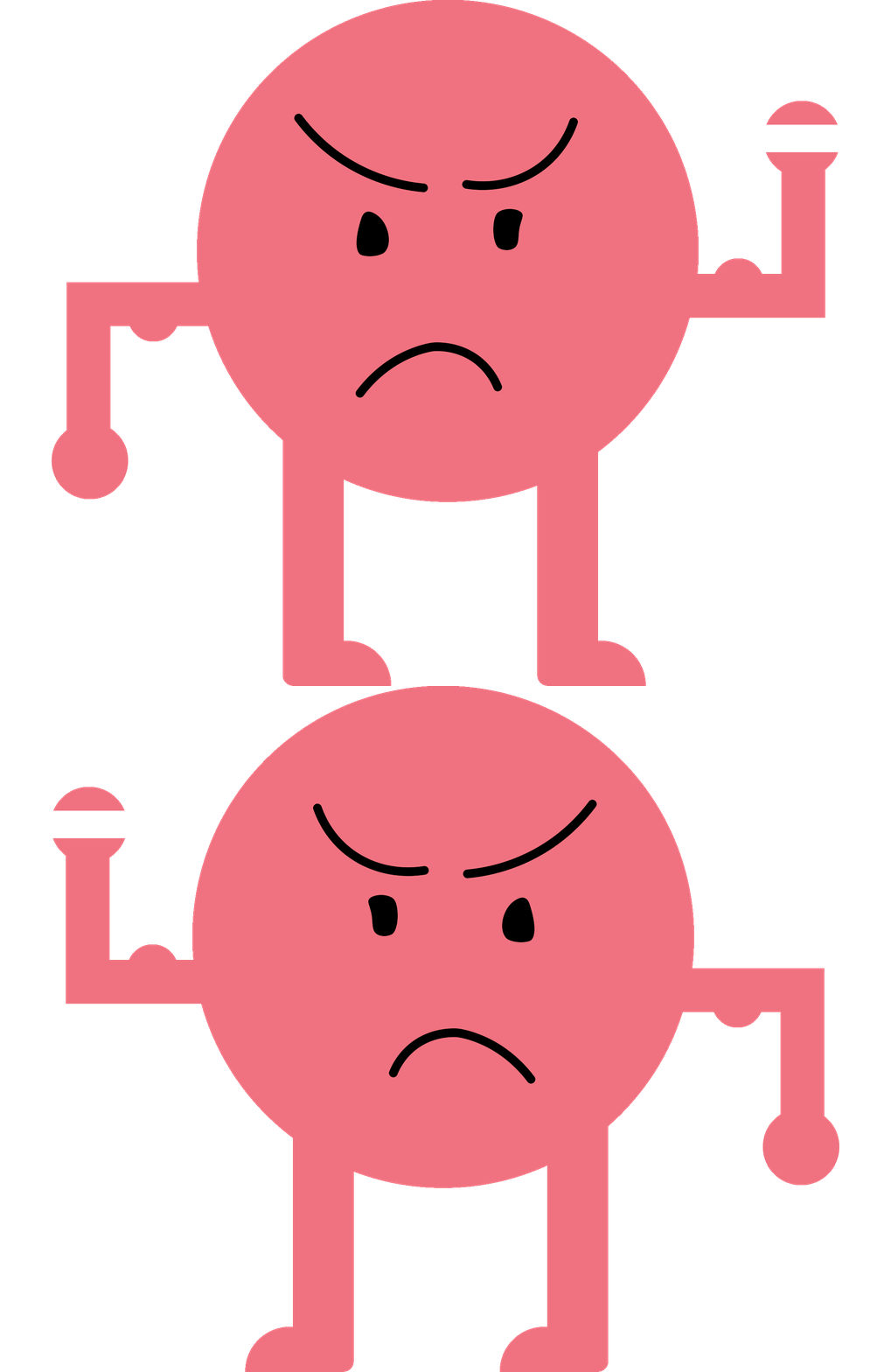
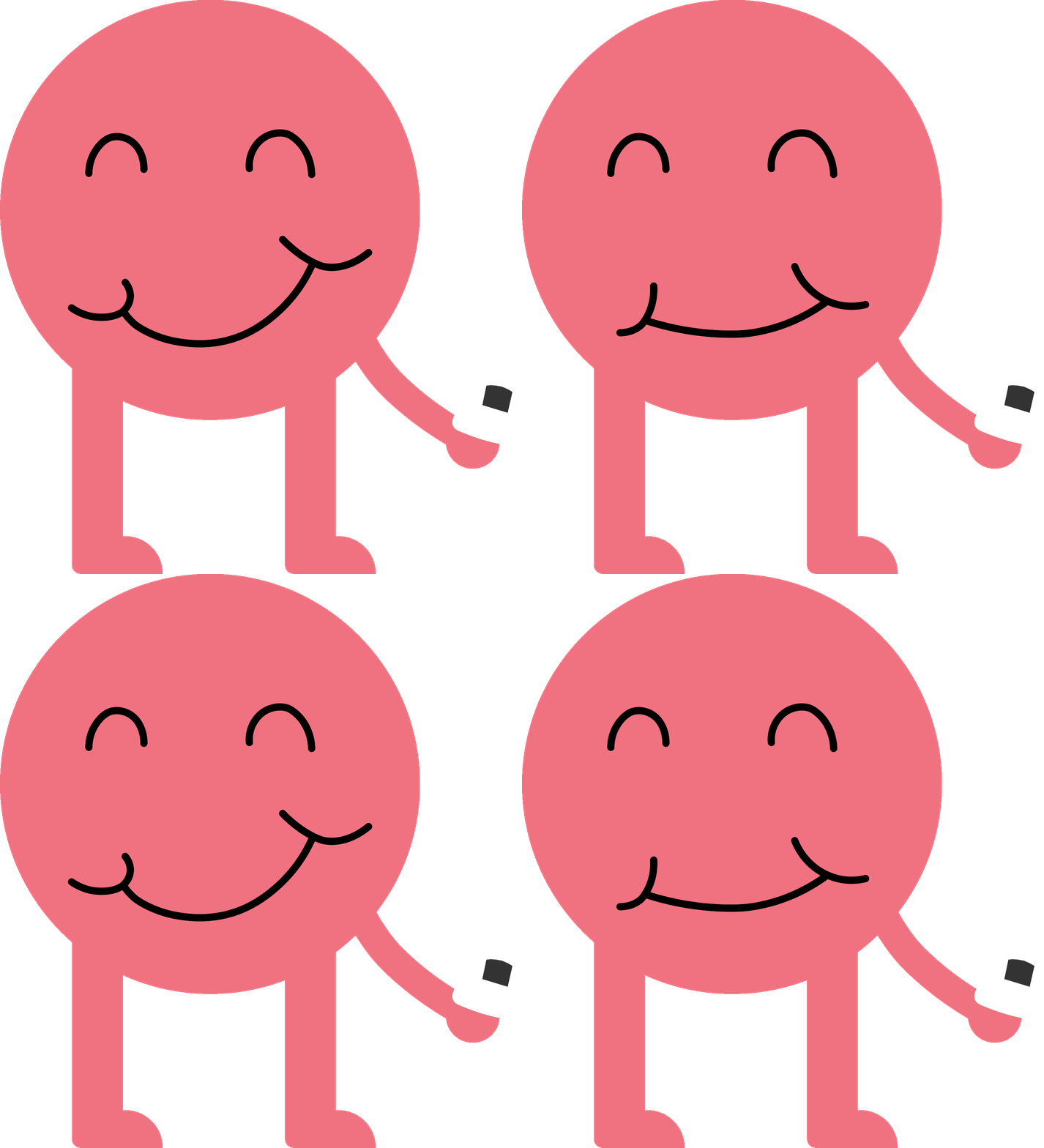
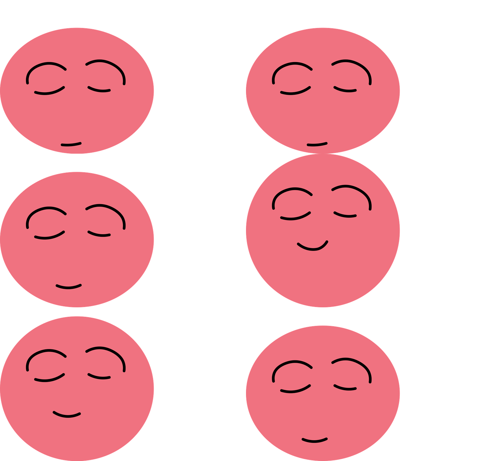
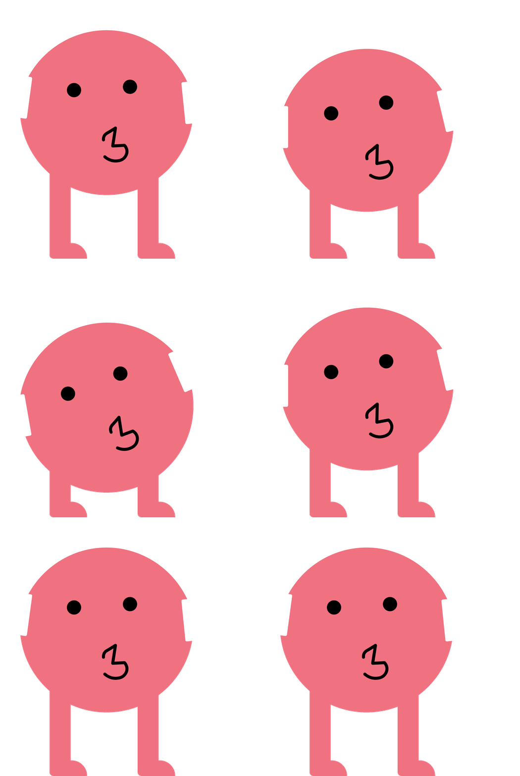
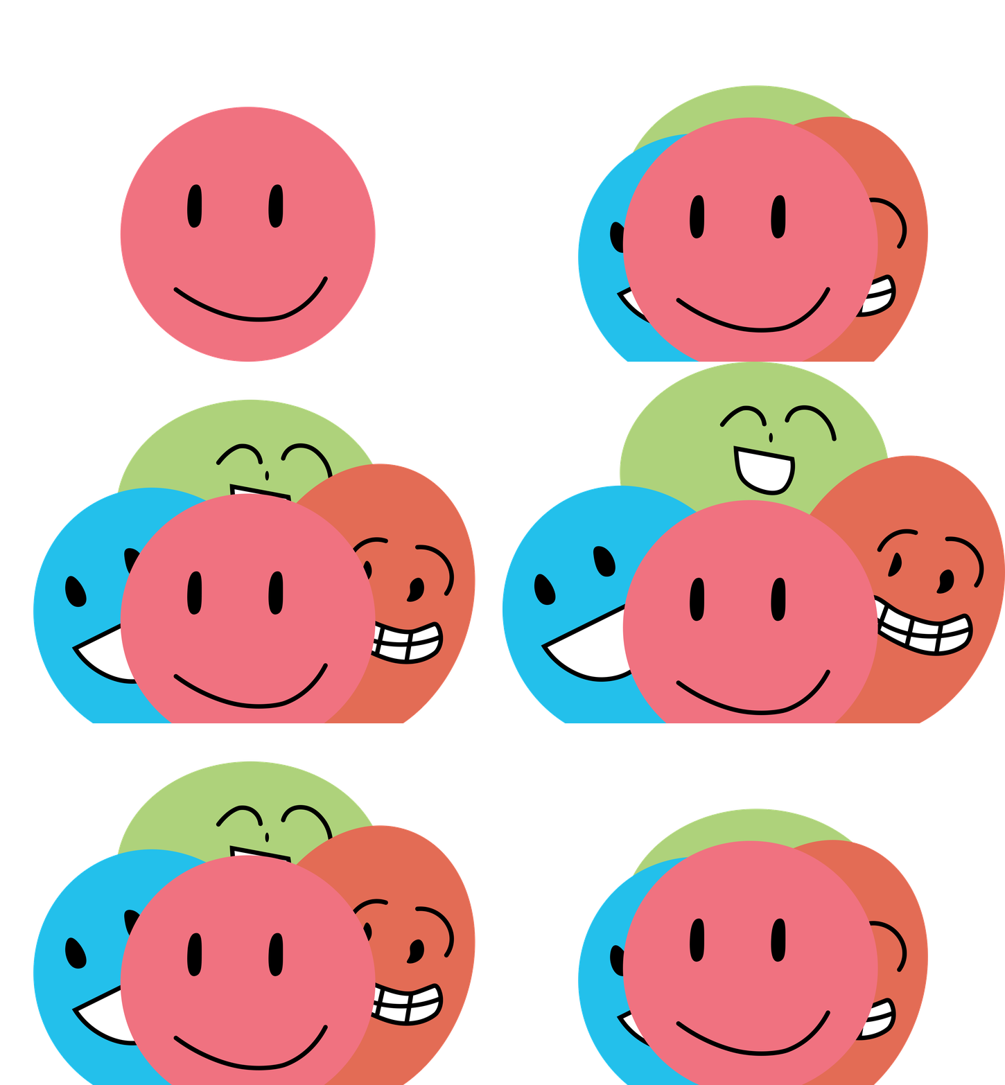
Animated figures add expression and movement to the learning experience.
\ Design Iterations
What testing changed
I gathered 20+ questionnaire responses, conducted 8 interviews, and ran two rounds of prototype testing with five participants in each round. Most participants were teenagers, which limited what I could learn about younger children.
01 · Give browsing a clear entry point
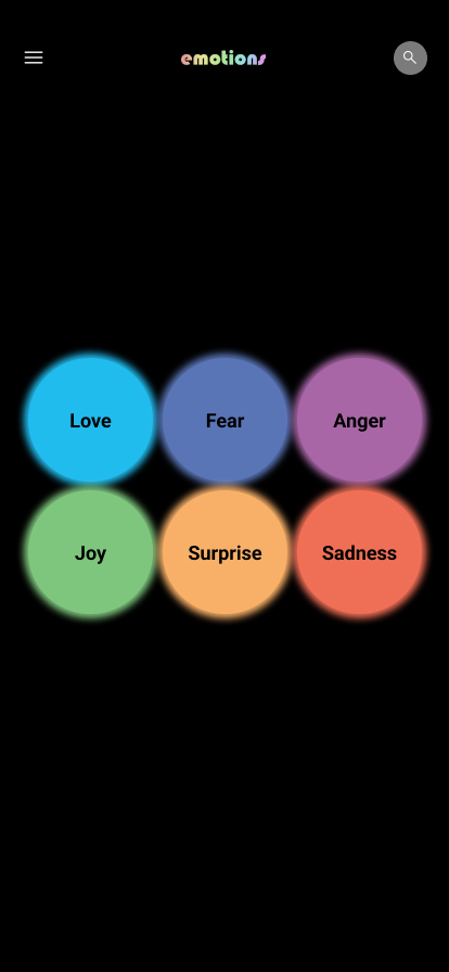
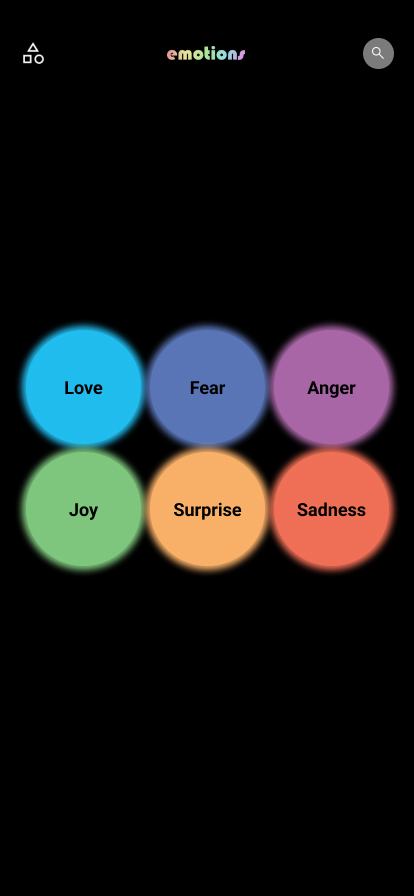
Participants enjoyed the exploratory interface, but also wanted a faster way to browse. I replaced the generic menu icon with a category icon and added All Emotions, Starred Emotions, and History.
Before · Generic menu
After · Category access
02 · Make content easier to read
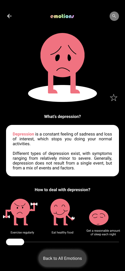
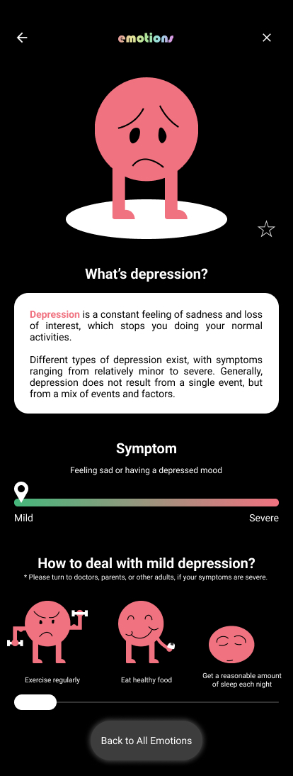
Feedback led me to increase text size and improve navigation through the description. I also narrowed the scope of the suggestions and added guidance to seek help from adults or professionals, rather than presenting the tool as treatment.
Before · Original description
After · Revised description
\ Reflection
A more focused purpose
The project began with a broad ambition to help young people manage negative emotions. Interviews and testing made the limits of that ambition clearer. I reframed the concept around emotional vocabulary and exploration. The work evaluated navigation and presentation; it did not establish learning outcomes or improvements in emotional wellbeing.
What I would test next
I would focus on a narrower age group, develop the content with educators and relevant specialists, and compare exploratory and direct browsing with tasks that measure comprehension as well as usability. The next step would be to test what young people actually learn, beyond whether they can use the interface.
Status: independent concept and interactive prototype · June–July 2022